
Artistic Literature
- lkibrahi
- Feb 5, 2019
- 2 min read
Updated: Feb 5, 2019
Literature was never a favorite of mine. Reading and writing always seemed like nothing more than a bland piece of text. But I've come to learn that much more goes into it than just the words. I never stopped to actually pay attention to the amount of detail often present in Ads, books, posters, etc. Everything that goes into it is there with specific purpose. This week we began looking at elements and principles of design within a piece of work and breaking down their intentions. This opened up a whole new perspective of literature for me. Everything from the color of the background, the size of the text, the font, images, and placement to symmetry, repetition, and balance is a key factor in the overall message.


Since we’ve discussed this in class, it’s hard to un-see it. I’m analyzing every poster I come across on the school's bulletin board. Looking at how the lines work together to move my eyes across a page, the colors making that one poster stand out in the clutter of papers stapled up there, and images put there for emotional appeal. As an artist, I appreciate creativity and design.
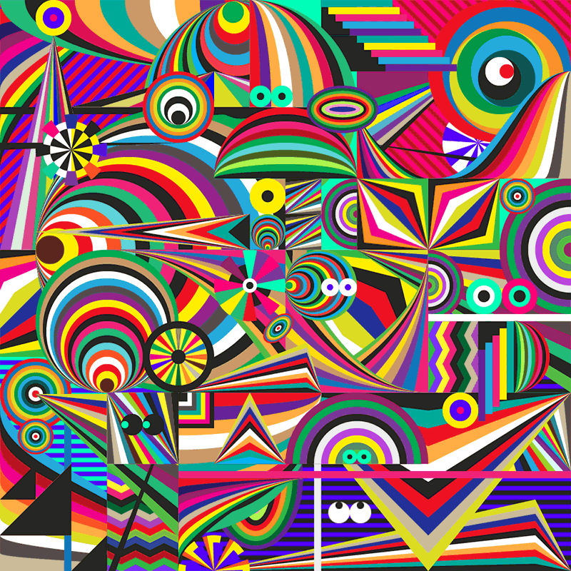
The color wheel is the first thing taught in art classes and that is for good reason. It’s the backbone of nearly everything we do whether that’s intentionally or not. Most of my art classes focused a lot on primary and more importantly complementary colors. These are colors across each other on the color wheel that work well (compliment) each other. For example, blue and orange, purple and yellow, and red and green. If you pay close attention, many T.V. advertisements, movie posters, articles, book covers, etc. use this technique as a way of capturing the audience’s attention with bright bold colors. Companies for this a lot. Google for instance uses the three primary colors and includes green right beside the red. This insures the logo is simple yet unique enough to be globally recognized. You can test this by asking someone to quickly name the colors of Google and they’ll more than likely identify at least the three primary ones.
https://www.ebay.com/itm/BLADE-RUNNER-2049-MOVIE-POSTER-2-Sided-ORIGINAL-FINAL-27x40-RYAN-GOSLING-/162898003416

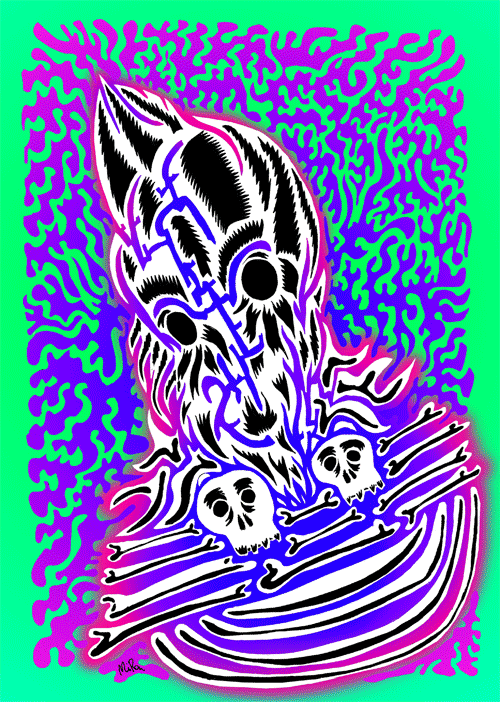
Last year in my IB art class, we were expected to use the elements of design. My concentration was the International Space Race and so I had to make a variety of art works relating to my topic of choice within the concentration. But the overall goal was to make sure that all my pieces came together at the end. It needed to make sure that every piece looked connected and like it belonged. In order to do this, my color pallets mainly consisted of hues of blue, black, purple, and white. But with all the blue hovering around, I threw in some orange here in there as a compliment and made sure to arrange everything in an easy to follow pattern.


Comments